
7 Features We Consistently See on Websites That Generate Enquiries
When people talk about websites that “convert”, the conversation can quickly turn to button colours, animations, pop-ups and marketing tricks.
In our experience, the fundamentals matter far more.
Most people arrive on a business website with a fairly simple set of questions:
- Have I found the right business?
- Can I trust them?
- What should I do next?
A good website helps them answer those questions quickly. A poor one introduces uncertainty. The message may be vague, important information may be hidden, or the visitor may have to work too hard to find a phone number or understand what the business actually offers.
There is no single design or layout that works for every business. A building company, musician, artist and print company will all need their websites to do different things.
However, there are some features we consistently see on websites that do a good job of turning visitors into genuine enquiries.
1. A clear opening message
The first section of a website should quickly explain what the business does, who it helps and, where relevant, where it works.
That sounds obvious, but plenty of websites still open with broad statements such as:
Quality you can trust.
Or:
Delivering excellence since 2005.
There is nothing particularly wrong with either statement. The problem is that they could apply to almost any business.
A new visitor should not need to scroll through half the homepage or open the About page before they understand what is being offered.
Regent Print is a good example of getting this right. Its opening heading says:
London based high quality print and display services that are fast and affordable.
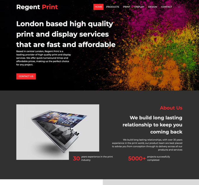
In one sentence, the visitor knows where the company is based, what it provides and what its main selling points are. The supporting text adds that Regent Print is based in central London and offers quick turnaround times and affordable pricing.
It does not try to list every available product in the first few lines. It gives the visitor enough information to know they are in the right place and then allows them to explore the services in more detail.
A strong opening section will normally answer four things:
- What does the business provide?
- Who is it for?
- Where is it available?
- What can the visitor do next?
The wording does not have to be clever. In fact, clever wording can sometimes get in the way.
Clear usually wins.
One useful test is to show the opening section to someone who does not know the business. Give them five seconds to look at it, then ask them what the company does. When the answer is unclear, the website probably needs a more direct opening message.
2. More than one easy way to get in touch
Once someone decides to make an enquiry, the website should not place unnecessary barriers in their way.
Different people prefer different ways of making contact. One person may want to call straight away. Another may want to send an email in the evening. Someone else may feel more comfortable starting a conversation through Instagram or completing a form.
A website does not need every possible contact method, but it should reflect how the business and its customers actually communicate.
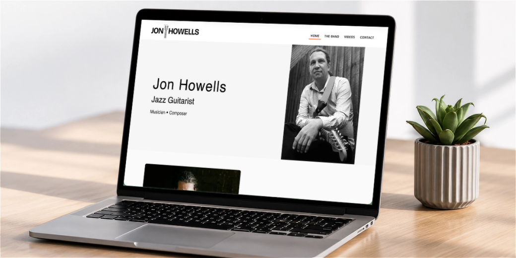
The Jon Howells - Jazz Band website is a good example. The main purpose of the site is to help people discover the band, see and hear them perform, and then get in touch about a wedding, private party, venue or event.
Visitors can use a phone number, email address, Instagram or a contact form. The contact page also places reviews close to the contact information, giving someone additional reassurance at the point where they may be deciding whether to make an enquiry.
That choice matters. A couple planning a wedding may want to send an email containing dates and venue information. A venue owner may prefer to call. Someone who discovered the band through social media may naturally want to continue the conversation on Instagram.
The website accommodates those different preferences rather than forcing everyone through the same route.
Contact forms also need some thought. It can be tempting to ask for every piece of information the business might eventually need, but a long form can feel like work.
The form should collect enough information to start a useful conversation, not try to complete the entire sales process.
For many businesses, that might be:
- A name
- A phone number or email address
- The service required
- A short message
Other questions can be added when they genuinely help. A trades business might ask for the property location. A musician may need the event date. A print company might ask about the required quantity or deadline.
The important thing is that every question has a purpose.
It also helps to tell people what will happen after they submit the form. A simple confirmation that the message has been received, along with an idea of when the business normally responds, removes another small piece of uncertainty.
3. Real evidence that the business can be trusted
Almost every business website describes the company as professional, reliable and committed to quality.
Those words are easy to write. The website needs to support them with evidence.
That evidence will vary according to the business. It might include:
- Photographs of completed work
- Customer reviews
- Project examples
- Before-and-after images
- Qualifications
- Professional memberships
- Recognisable clients
- Clear guarantees
- Photographs of the people behind the business
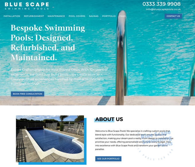
For a company such as Blue Scape Pools, the customer is considering a significant project. They are not just buying a low-cost product online. They need confidence in the company’s workmanship, experience and ability to manage the work properly.
The Blue Scape Pools website builds that confidence in several ways. It uses photographs of genuine completed projects, displays detailed customer feedback, links to its five-star Google reviews and provides an extensive portfolio of pool construction and refurbishment projects. The portfolio also includes recognisable project descriptions and locations rather than relying on a generic image gallery.
These elements support one another.
The photographs show what the company can produce. The portfolio provides more detail. The reviews explain what customers valued about working with the team. Together, they are much more convincing than simply stating that the company provides a high-quality service.
Stock photography can help set the tone of a website, but it rarely proves what a business can do. Where possible, real work, real people and real customer experiences will carry more weight.
The reviews themselves also matter. A specific review explaining how the company solved a problem, communicated throughout a project or responded when something changed is usually more useful than a collection of short comments saying “great service”.
Businesses should not be afraid to show the detail. That is often where the trust is built.
4. A website that works properly on a phone
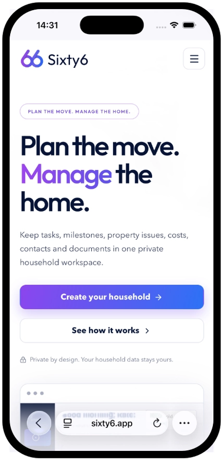
A mobile-friendly website is not simply a desktop website made smaller.
The order of the information, size of the buttons, length of the forms and way images are displayed all need to work on a smaller screen.
Someone viewing a business website on their phone may be:
- Comparing several local companies
- Looking for a phone number
- Checking whether the business covers their area
- Viewing examples of previous work
- Trying to find opening times
- Sending an enquiry while away from their desk
They should not need to zoom in, scroll sideways or work through several menus to find basic information.
The most important actions should remain easy to reach. Phone numbers should be clickable. Forms should be comfortable to complete. Text should be readable without zooming, and large images should not make the page painfully slow or difficult to navigate.
It is also worth testing the website on an actual phone rather than relying entirely on how it looks in a website editor.
A page can technically adjust to a smaller screen while still being awkward to use.
A straightforward test is to open the website on your phone and try to complete a few common tasks:
- Work out what the business does.
- Find its main service.
- Check whether it covers your area.
- View an example of its work.
- Find a review.
- Make an enquiry.
When any of those tasks feels difficult, there is probably something worth improving.
Mobile design is not about stripping everything away. It is about deciding what matters most and making sure it is easy to use.
5. Useful information about each service or product
A homepage can introduce a business, but it cannot always answer every question a potential customer may have.
Important services and products need enough space to be explained properly.
Regent Print offers a broad range of products, from business cards, brochures and booklets to banners, shop signs, exhibition displays and bespoke boxes.
Trying to explain all of those properly in one section of the homepage would be overwhelming. Instead, the website provides a dedicated product area, with products organised into useful categories such as booklets, advertising, event products, banners and pitch products. Visitors can explore the category or product that is relevant to their particular job.
Blue Scape Pools needs a different structure. Its customers are not choosing between dozens of small print products. They may be researching a new swimming pool, refurbishment, ongoing maintenance, a pool cover or a sauna.
Those services are separated so that each type of customer can find information relevant to the project they are considering. The site also supports the service information with frequently asked questions and completed projects.
In both cases, the website is organised around what the customer is trying to find.
A useful service page will usually explain:
- What the service is
- Who it is intended for
- What problems it solves
- What is included
- How the process works
- What the customer may need to provide
- What happens after an enquiry
It does not necessarily need to answer every possible question. The aim is to give someone enough information to decide whether the service is relevant and whether they would like to begin a conversation.
There is also a balance to strike.
Not every minor product or variation needs its own page. Creating dozens of short pages with almost identical wording can make a website harder to manage and less useful to visitors.
The structure should reflect genuine differences between services, products and customer needs.
6. Genuine local relevance
For a business serving a particular area, the website should make that clear.
A customer looking for a local builder, plumber, consultant or other service provider usually wants to know whether the company works in their area before spending time exploring the rest of the website.
Local relevance is not about repeating a town name in every sentence. It is about providing useful evidence that the business genuinely operates in that location.
Trendy Extensions makes its main service area clear from the opening section of the website. It describes itself as a builder providing home transformations in Hertfordshire and Essex, with supporting information explaining that it also works across North London.
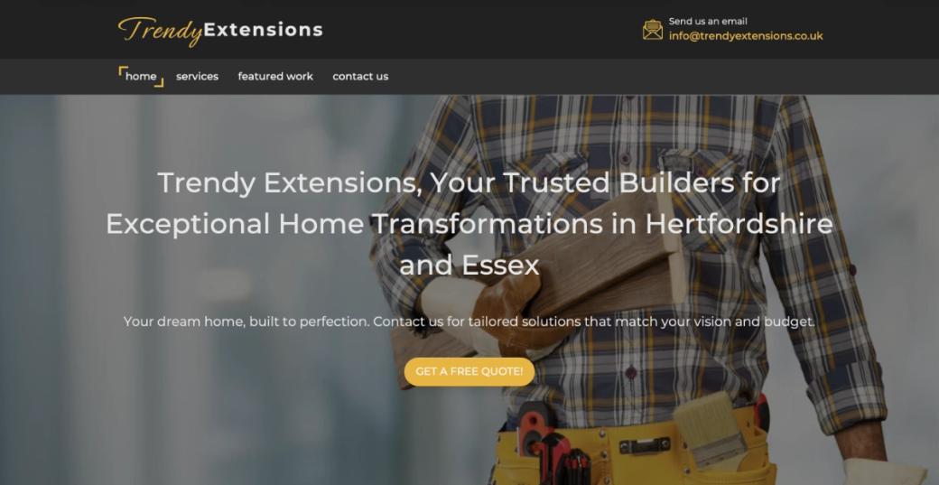
Further down the site, visitors can see featured projects, customer testimonials and a more detailed list of places served, including Bishop’s Stortford, Hertford, Harlow, Loughton, Ware and Epping.
This works because the location information is connected to a genuine service area and supported by real work and customer feedback.
Other useful signs of local relevance might include:
- A business address
- Clear directions
- Parking information
- Local telephone details
- Projects completed in named areas
- Customer reviews mentioning locations
- An explanation of how far the business travels
- Accurate opening and contact information
What should normally be avoided is creating a large number of almost identical pages for every nearby town, with little more than the place name changed.
A page about a particular area is much more useful when it contains something specific: a completed project, relevant service information, local photographs or practical details for customers in that location.
The aim is not to appear local everywhere. It is to be clear about where the business genuinely works.
7. A clear and appropriate next step
A call to action is often treated as a design feature: add a bright button saying “Contact us” and the job is done.
In reality, the wording and destination of that button matter more than its colour.
The appropriate next step depends on who is using the website and what they are trying to do.
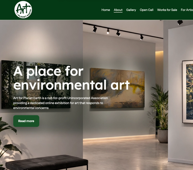
Art for Planet Earth has several distinct audiences. Artists may want to submit work to an open call. Visitors may want to explore an online exhibition. Other artists may be looking for information about displaying or selling their work.
The opening section recognises those different intentions and presents three clear routes:
- Enter an Open Call
- Explore the Gallery
- For Artists
The same approach continues throughout the site. Sections about open calls lead artists towards submitting work, while gallery content directs visitors towards exhibitions and art available to view or purchase.
This is more useful than giving every visitor the same generic “Learn more” button.
A good website normally has one clear primary action, supported by other routes for people who are not ready to take that step.
For one business, the primary action might be to request a quote. For another, it could be to book a consultation, check availability, send photographs, view recent projects or explore a product range.
The wording should tell people what will happen when they click.
“Request a quote” is clearer than “Submit”.
“View recent pool projects” is clearer than “Discover more”.
“Enter the open call” is clearer than “Get started”.
The goal is not to pressure someone into making contact before they are ready. It is to remove uncertainty about what they can do next.
A simple way to review your own website
Open your homepage on a phone and look at it as though you know nothing about the business.
Then ask yourself:
- Can I tell what the business does within a few seconds?
- Is it clear who its services are for?
- Can I see where the business works?
- Is there genuine evidence of its experience and previous work?
- Can I find useful information about the service I need?
- Is there an obvious way to get in touch?
- Do I understand what will happen after I make an enquiry?
It can also help to ask someone who is unfamiliar with the business to complete the same exercise.
Business owners naturally know what they mean. They fill in gaps without realising it because they already understand the services, the process and the terminology.
A new customer does not have that knowledge.
Their answers can reveal unclear wording, missing information and unnecessary obstacles that are difficult to see when you work with the website every day.
Bringing everything together
None of these features guarantees that a website will generate enquiries on its own.
They work together.
The opening message helps someone recognise that they have found the right business. The service information answers their questions. Reviews and project examples build confidence. The mobile experience, contact options and calls to action make it easier to take the next step.
In many cases, a website does not need more animation, more complicated features or more pages.
It needs to create less uncertainty.
That is what turns a website from something a business simply has into something that actively supports it.
At Uncommon, we start by understanding the business, its customers and what the website needs to achieve. We can then make it clear, credible and easy to use—and continue helping as the business and website develop.